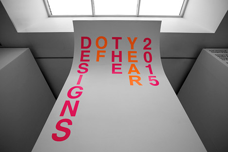
This exhibition was developed by Benjamin Hubert's studio utilizing a modular system of display plinths and wall mounts. The Designs of the Year exhibition was located in London's most famous Design Museum's top floor. Designer Benjamin Hubert was tasked in the creation of all 76 projects all having different backgrounds and limitations. These projects ranged from huge architecture projects to interactive road crossings, apps and cars among others. The man himself can be seen below.

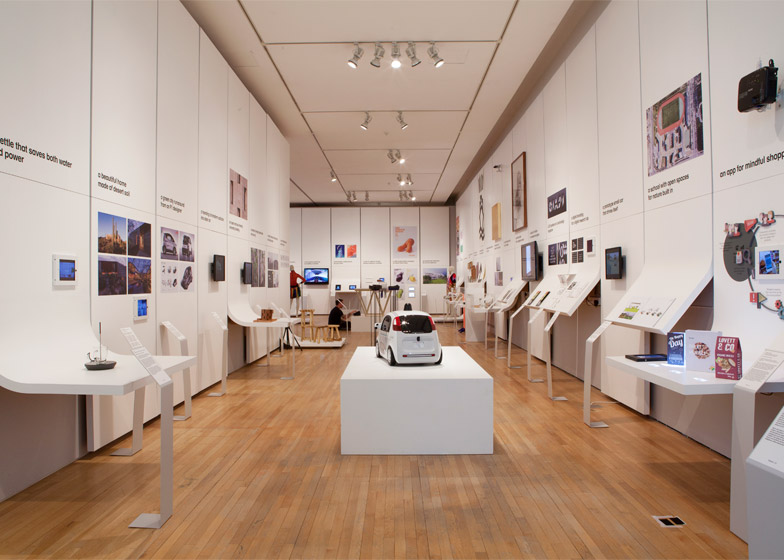
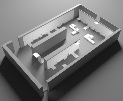
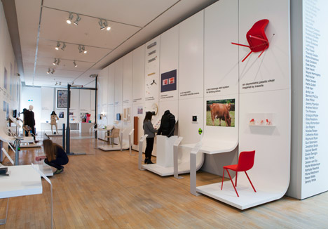
The exhibition was split into 1 entry corridor leading into 3 other corridors all exhibiting different pieces, these corridors than converge into one open space roughly the size of the corridors doubled.
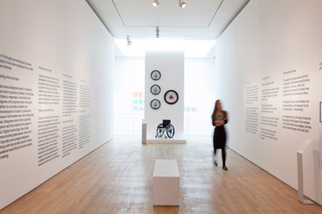
There was clever use of lighting in this exhibition utilizing both natural and artificial light. In the center of the entrance corridor there is a sizable skylight letting in rays of light which seem to illuminate the entire exhibition, all the way to the back. I think this was aided by the clean white walls allowed the light to bounce off it rather than absorb, this reduced the amount of artificial lighting needed and created clean and natural ambiance lighting. This lighting created some interesting shadow effects which further enhanced the rooms aesthetics.
Also present where spotlights which scattered the clean ceiling. I don't think that there was one per project but rather depending on the projects function, this meaning that you wouldn't place a spotlight on a monitor. The spotlights themselves didn't overly direct light onto specific objects, only providing a subtle boost in white light which still rose the importance of the pieces they were being shone upon.
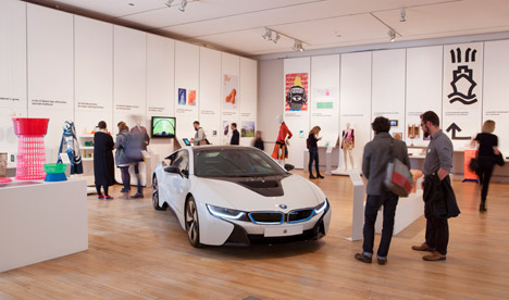
The flooring consisted of a slightly reflective wooden parquet. It provided some naturalism to the slick, clean and artificial walls. The pattern was consistent only broken a few times by what I assume to be electrical vent.
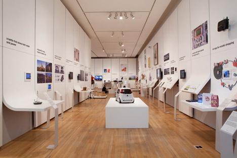
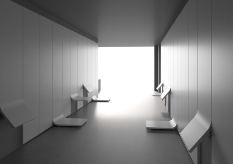
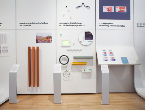
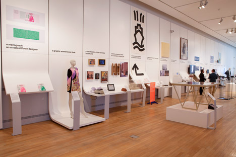
As the exhibition was exhibiting different projects from different backgrounds the space had to be able to adapt to different shapes and sizes. The walls or plinths held the bulk of the work, each one having a specific design shape depending on the object it is exhibiting. The plinths are split into to parts leaving a clean and thin line further adding on the design theme. Just above this line a single sentence was displayed in a black type face which conforms with the Design Museum's branding. In front of these modular faces were equally slick stands with information regarding the project behind it. All of these were created using pine panels covered with a strip of flexible MDF which was later coated with a smooth white finish.
The exhibition also catered for free standing projects which were displayed on clean white and seamless boxes of different shapes and sizes. These were strategically placed in the center of the corridors and the back area making sure not to close off and pathways.
One drawback the exhibition space has is the way one can access it, to do this one requires to go up a flight of stairs. I cannot see if there are any elevators or escalators in my research so that people with special requirements can access the upper levels easily but when you get to the exhibition space it is fairly easy to navigate.
The size of the space is rather small so you wouldn't need drastic signage to inform the visitors of
how to traverse the space. One can chose whatever path to take, maybe go round the edges and finally
walk through the center corridor or zigzag through the corridors and take your time in the open space
admiring the works in peace.
What really interested me about this exhibition space was the absence of any unnecessary collateral such as wires ore even wire covers. All of it was hidden where I assume to be in the ceiling panels and under the floor boards. The typography was displayed in a way depending on its contents. Meaning that the clever one liners were using larger fonts and raised above the average persons height for all to see, other bulk text was at below the users eye line roughly children's height. This way all could read it regardless of your heightThe museum's branding also took part in how the type was displayed as stated before.
Sources :
http://www.dezeen.com/2015/04/01/benjamin-hubert-exhibition-designs-of-the-year-2015-design-museum-london/


